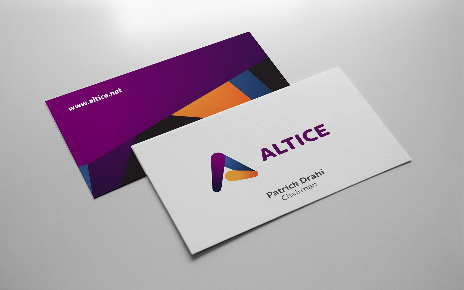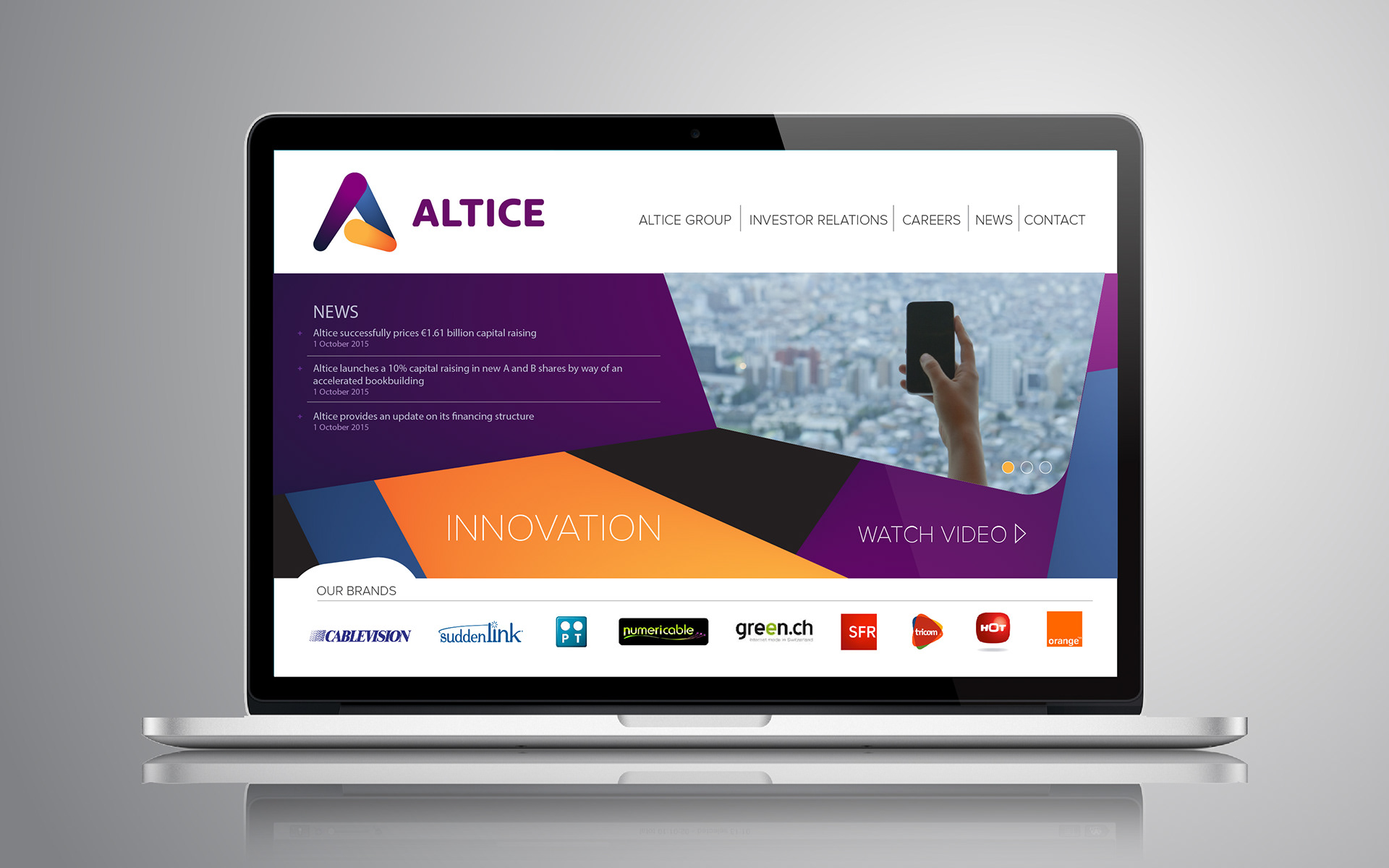

This was a visual and strategical brand study done by Mybrand for Altice in order to analyze and propose solutions to the Atice Group brand architecture. This rebrand proposal that was aligned and inspired by the present logo. The idea of circles that travel in space is now taken to another level, speed and accuracy takes shape and brings out the letter "A", the new symbol for Altice. The colours are based on the current palette adding a corporate blue.

